Gears of War
Balancing innovation and tradition: Navigating the evolution of the Gears of War franchise while staying true to its iconic DNA.
Platforms:
Xbox, PC, PlayStation
My Role:
Senior UX Designer
Studio:
The Coalition
Timeframe:
2015 – Present

Challenge
LEGACY: Designing for a franchise like Gears of War presents a unique challenge. You're operating within a decade-old ecosystem defined by iconic branding, distinct mechanical "feel", and a community of fans who hold the IP to an incredibly high standard. Our core challenge: Introduce Gears to a new generation and bring the UX to modern standards without losing the franchise's soul.
LEARNING: Coming from multi-device product design, the leap into AAA games introduced a new element to how I approached a problem, the tempo of information. I had to design for a game’s pulse: when to surface information, the duration it remains, and where it lives on-screen to ensure the player feels empowered, never overwhelmed. This case study explores how that design evolved, from iterative refinements in Gears of War 4 to a bold, system-wide transformation in Gears 5 and beyond.
PROCESS: The following is not an exercise in process theatre. Game design is messy. Fun matters, intuition matters, directors matter, player emotion matters, production REALLY matters… and sometimes that means the process they teach us in school goes out the window extremely quickly. The trick is to navigate that chaos without losing sight of the player. To make thoughtful decisions with incomplete information, and to adapt quickly when reality changes, which it does… a LOT.
Gears of War 4: Learning To Walk
Gears of War 4 was my first project in the games industry, but it was also The Coalition's first time making an original Gears game… we had to learn HOW to make a Gears game before we could evolve the experience and make it our own in Gears 5. With that in mind, my UX philosophy for the game was:
Stick to the fundamentals, prioritize clarity, and respect the familiar design patterns returning players expected.
Gears is all about weight and impact. To match the 'heavy' feel of the characters and the world, I wanted to emphasize a structured hierarchy that was predictable, simple to navigate, and pulled inspiration from the original trilogy.
The UX process wasn’t particularly mature when I joined the project later in development, so many decisions were heavily director-driven, constrained by tight production timelines, and validated through lightweight observational playtests. Rather than trying to overhaul the process overnight, I focused on gradually introducing more UX design-thinking into the team through short learning sessions and collaborative discussions with designers, artists, and engineers. The goal was to show how small usability improvements could create meaningful long-term benefits for both players and future projects (see the last image in this section for an example: my ‘Active Waiting’ tip). Over time, these conversations helped break down silos, improve communication across disciplines, and slowly shift how we approached player experience as a team.
KEY TAKEAWAYS
Leaning on the original trilogy helped reduce unnecessary risk and freed us to focus on execution and feel rather than reinventing systems.
A clear design that ships is more valuable than an ambitious one that doesn't. Our designs are shaped not only by ideas and intent, but by timelines, dependencies, and technical realities. Learning to design within those constraints is just as important as the UX work itself.
Observe, observe, observe. Players rarely experience a feature the way it was intended on paper. Moments of hesitation, confusion, or frustration are consistently revealed during playtests. The quicker you can get designs in front of users, the quicker you'll reveal the biggest usability problems.
You need to train your gut before you can trust it. It's okay to rely on references, genre conventions, and feedback from others. Over time, repeated iteration helped me build the judgement needed to make stronger decisions with less certainty.
Bonus Tip: MVPs have a funny habit of becoming final products. Make sure it's an MVP that everyone is pleased with because it's often the version that gets shipped.


Gears 5: From Simplicity To Scale
After shipping Gears of War 4, where we were focused on learning the rules and nailing the fundamentals, Gears 5 became an opportunity to evolve the franchise into something significantly broader, more social, and more interconnected. The game adopted a live-service model, bringing with it a massive increase in progression systems, player identity, social features, events, and player data. Almost every feature introduced new edge cases and dependencies.
At the same time, we were shipping on an aggressive three-year production cycle, which meant traditional UX processes often had to give way to rapid collaboration, fast iteration, and pragmatic decision-making. To help the team move quickly, I facilitated 'Quick 30' ideation sessions focused on rapidly translating ideas into flows, wireframes, and visual direction.
As the game expanded, so did the complexity of player feedback. In partnership with the User Research team, I designed an in-game feedback system that allowed us to capture player sentiment closer to the moment of interaction rather than relying solely on external surveys or post-launch discussion.
KEY TAKEAWAYS
As the game grew throughout production, maintaining consistency became increasingly difficult. We'd sometimes prioritize solving the immediate player problem with unique layouts or interactions over preserving consistency. While it worked at the time, we've since shifted into putting in the ground-work to create design systems that can scale over time, saving us effort in the long run and improving usability.
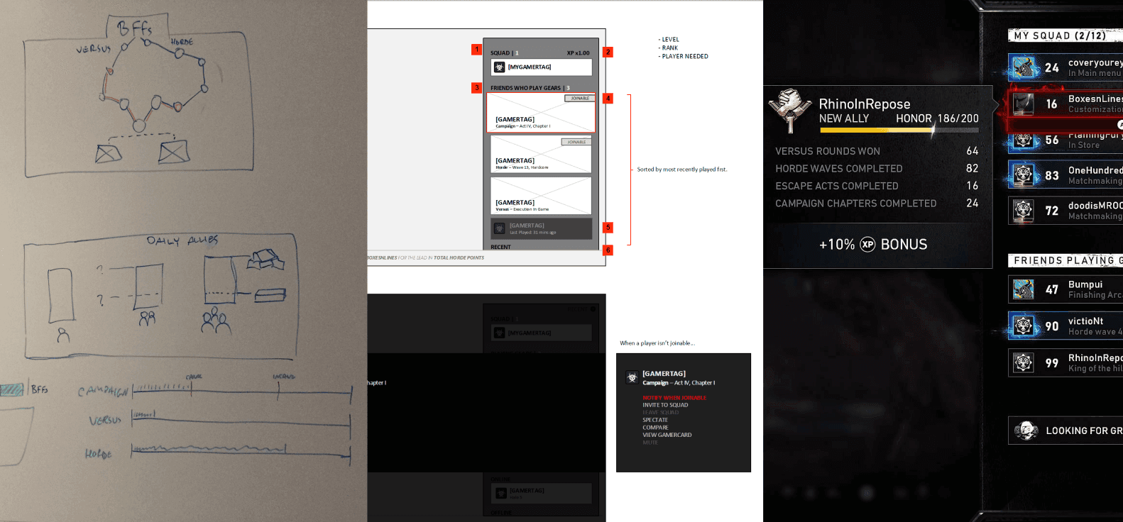
Gears is one of the few franchises that still champions couch co-op. Designing for three-player split-screen forced me to prioritize hierarchy, scanning behaviour, and navigation clarity much more aggressively than full-screen experiences demanded. Lobbies, for instance, are organized into three columns to allow all players to navigate simultaneously when the screen is split in three, whereas the post-match layouts are structured more horizontally, allowing for screen-space reduction while preserving the experience for all players.
I wanted to adopt an Optimistic UX framework (assuming service calls will succeed and updating interfaces immediately rather than waiting for server confirmations first) in order to reduce real and perceived friction. For the most part it worked quite well, the trade-off being that on very infrequent occasion, players would see a screen that then changed a few moments later as services came back with updated information.
Accessibility is worth it. While I wasn't directly embedded in the Accessibility strike team until later, exposure to accessibility reviews and SME discussions during Gears 5 significantly influenced how I approached readability, information hierarchy, and player flexibility moving forward. Seeing players with accessibility needs respond so positively reinforced how impactful thoughtful UX decisions can be when they remove barriers.
Gears 5: From Simplicity To Scale
After shipping Gears of War 4, where we were focused on learning the rules and nailing the fundamentals, Gears 5 became an opportunity to evolve the franchise into something significantly broader, more social, and more interconnected. The game adopted a live-service model, bringing with it a massive increase in progression systems, player identity, social features, events, and player data. Almost every feature introduced new edge cases and dependencies.
At the same time, we were shipping on an aggressive three-year production cycle, which meant traditional UX processes often had to give way to rapid collaboration, fast iteration, and pragmatic decision-making. To help the team move quickly, I facilitated 'Quick 30' ideation sessions focused on rapidly translating ideas into flows, wireframes, and visual direction.
As the game expanded, so did the complexity of player feedback. In partnership with the User Research team, I designed an in-game feedback system that allowed us to capture player sentiment closer to the moment of interaction rather than relying solely on external surveys or post-launch discussion.
KEY TAKEAWAYS
As the game grew throughout production, maintaining consistency became increasingly difficult. We'd sometimes prioritize solving the immediate player problem with unique layouts or interactions over preserving consistency. While it worked at the time, we've since shifted into putting in the ground-work to create design systems that can scale over time, saving us effort in the long run and improving usability.
Gears is one of the few franchises that still champions couch co-op. Designing for three-player split-screen forced me to prioritize hierarchy, scanning behaviour, and navigation clarity much more aggressively than full-screen experiences demanded. Lobbies, for instance, are organized into three columns to allow all players to navigate simultaneously when the screen is split in three, whereas the post-match layouts are structured more horizontally, allowing for screen-space reduction while preserving the experience for all players.
I wanted to adopt an Optimistic UX framework (assuming service calls will succeed and updating interfaces immediately rather than waiting for server confirmations first) in order to reduce real and perceived friction. For the most part it worked quite well, the trade-off being that on very infrequent occasion, players would see a screen that then changed a few moments later as services came back with updated information.
Accessibility is worth it. While I wasn't directly embedded in the Accessibility strike team until later, exposure to accessibility reviews and SME discussions during Gears 5 significantly influenced how I approached readability, information hierarchy, and player flexibility moving forward. Seeing players with accessibility needs respond so positively reinforced how impactful thoughtful UX decisions can be when they remove barriers.


Gears of War: E-Day: Returning To Our Roots
While I can't share detailed production work from Gears of War: E-Day just yet, this section will be updated after launch with a deeper look into my most recent UX work at The Coalition, including:
Figma prototypes and interaction explorations
UX flows, wireframes, and feature thinking
A custom feature tracking system used to help manage UX work across development
And more…

Next Case Study
Barreleye
Next Case Study
Barreleye

Next Case Study
Barreleye
Next Case Study
Barreleye
Next Case Study
Barreleye
Next Case Study
Barreleye